IMAX Master Brand
MOTION GRAPHICS PACKAGE


The Brief
Throughout its 50 year history, IMAX had never created a comprehensive motion graphics package for all channels: digital/social, OOH, and in-theatre. So utilizing the capabilities of our internal creative agency, we set out to fix that.
Our objective was to translate the IMAX brand identity into motion in a way that felt natural and organic and authentic to IMAX.
In terms of deliverables: the goal was to create an end-to-end package that would meet every anticipated motion graphics need: encompassing a new ident for in-theatre and online, lower thirds, intros and outros, transitions, end cards, and social-specific needs.


The Strategy:
Regarding color, it was crucial to find a way to walk the line between staying true to IMAX’s signature blue, while also taking small steps to expand the brand into new territory. So while we moved beyond just using IMAX’s PMS 285C, keeping a hint of blue cast over everything was key to maintaining a color consistency that mapped back to the brand’s 50 year history, while also moving forward into the future.
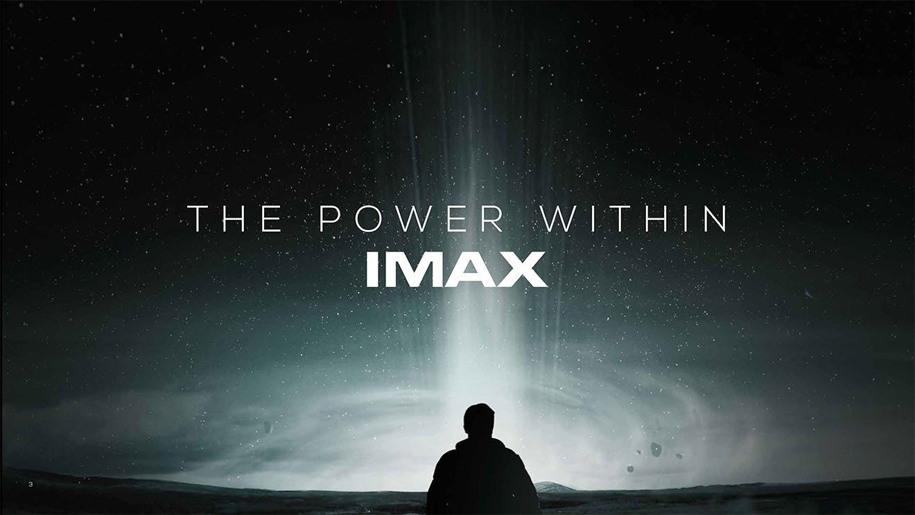
After an exhaustive exploration of possible creative territories, we ultimately landed on Light and Shadow as an appropriate territory for IMAX, given that light is the medium through which we bring the IMAX Experience to life with our projectors, and shadow is the obvious counterpoint to light. This was further honed to The Power Within IMAX, with the light being the source of our power.


The Creative:
In the creation of our new in-theatre ident, we considered a number of core pillars that felt true to the IMAX brand. First off, the IMAX Experience is a spectacle of scope and scale, given the large size of our theatre screens and quality of our sound (and the cinematic journeys they take viewers on), so we wanted the IMAX logo to feel massive.
Part of how we accomplished this was by situating it in outer space, and the other part was by beginning the ident inside the logo, and making it feel very solid and architectural. But we also wanted to create the sense that, while it seems solid, it is capable of startling transformation, containing a sense of illusion as well.