Truly Hard Seltzer
BRAND BOOK


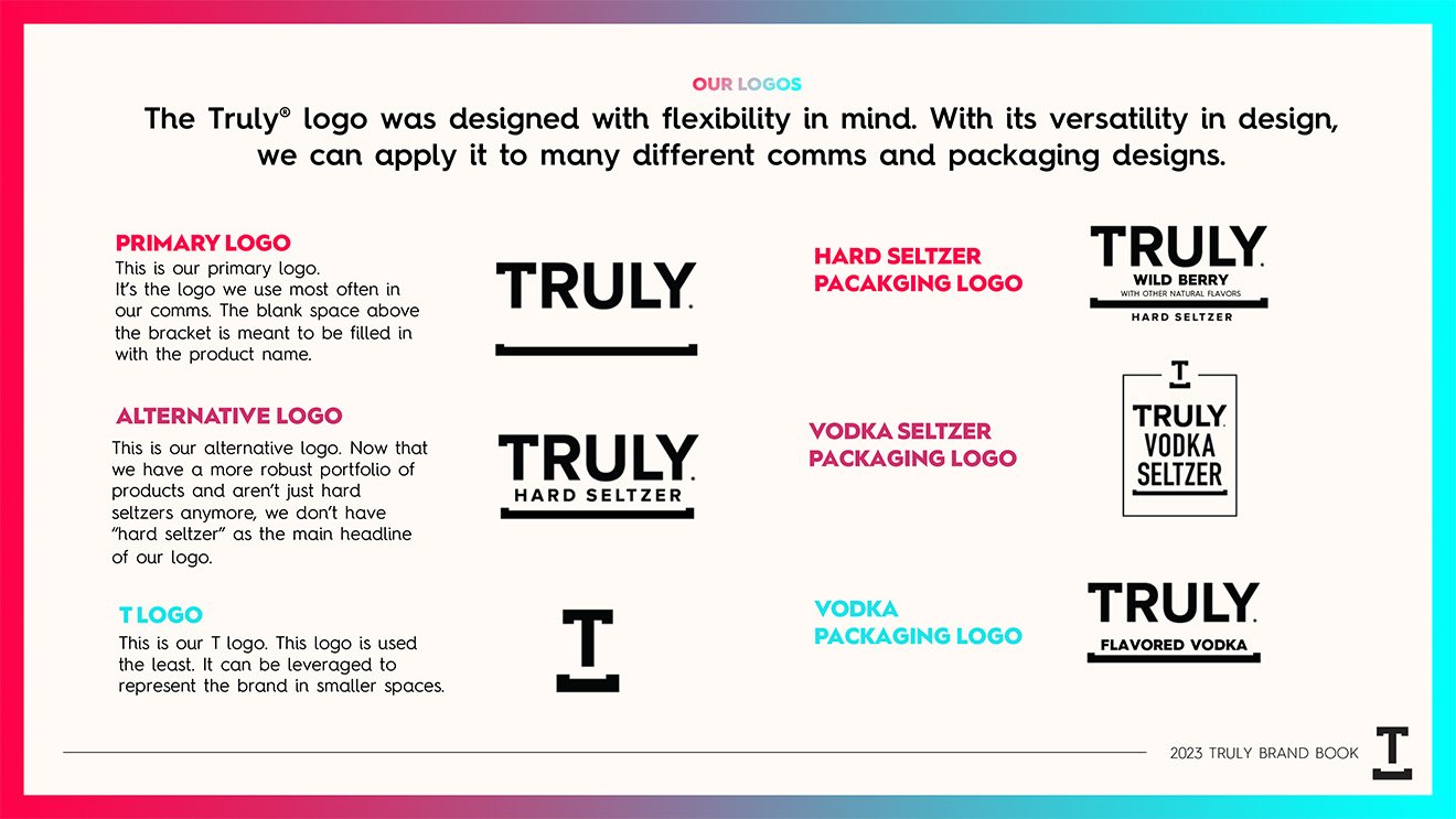
The Brief:
After Truly Hard Seltzer’s launch in 2016, 6 years of explosive rocket ship growth, and several brand refreshes, at the end of 2022 Truly still did not have a cohesive brand book or style guide that adequately encompassed our brand identity. As a result, communications across the brand’s entire history had been visually and strategically inconsistent, with creative assets coming from numerous sources, both from external agencies and internal creative teams, expressing a wide range of variations on the brand’s identity, across digital, point of sale, OOH, television, online video, and social.
I was tasked with creative directing and designing a distinct brand book that could be utilized both by internal teams, as well as agency partners, to ensure a unified brand expression, no matter the source, no matter the channel.
The Strategy:
Known for constant innovation in the hard seltzer space, and with an ever-expanding portfolio including Vodka and Vodka Seltzer, in addition to Hard Seltzer, and numerous forthcoming new products, the challenge in constructing a brand book for Truly was to build a brand and design architecture that was fluid enough to contain new additions to the portfolio, yet visually distinct enough to create a cohesive brand identity.
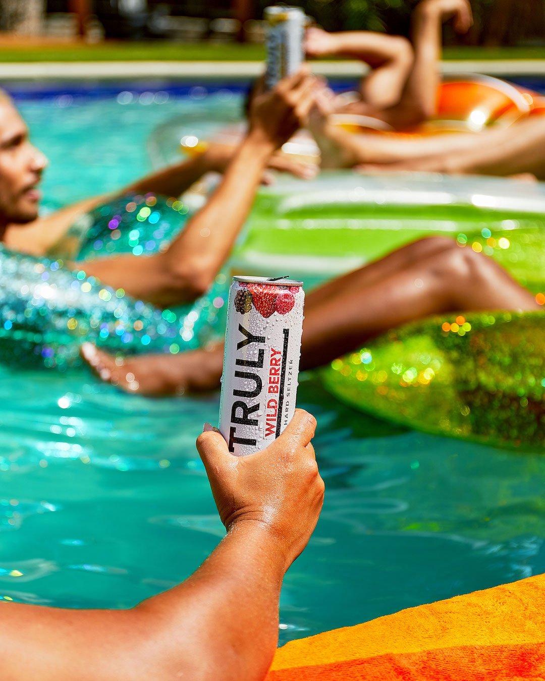
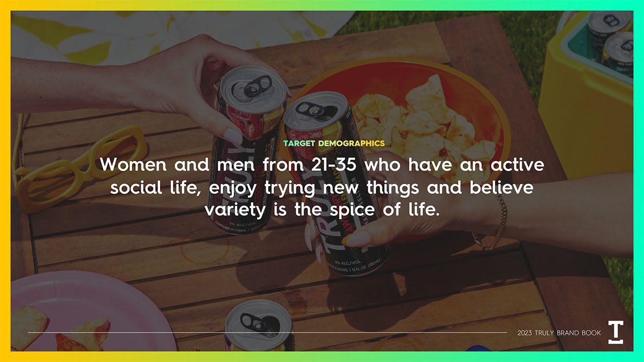
We conducted demographic research with strategy firm, Blue Ocean, to build a roadmap of our brand positioning, which became the backbone of our brand book. The ideal territory we identified for the Truly brand was a primarily daytime drinking occasion, from 12-8pm, during highly social occasions in which Truly is the ideal sessionable beverage for friends to share.
We also identified 5 core brand principles that sum up the Truly brand identity:
Exploration
Inclusivity
Innovation
Fun
Positivity


The Execution:
Both due to Truly’s wide variety of flavors (30+ and counting), as well as the branding of our main competitor, White Claw, which utilizes primarily black and white imagery in all its comms, we opted to make a cornerstone of our brand identity a range of bright, high-saturation colors, both in design and photography, and as such this was an imperative part of our brand book design.
Translating our brand positioning into creative, we arrived at the following guidelines:
Always show product during daylight hours, using natural sunlight
Utilize high saturation colors in art direction of props and locations
When showing people, strive to show fun social occasions, ideally with more than one person in the shot, creating the sense that they are socializing.
If not showing more than one person, utilize props to imply the presence of others just outside the frame.